Tutorials: How to change the layout of both Tags and Collections in ZotEZ2
In today's tutorial, we will cover one of the biggest new features introduced in ZotEZ2: a considerably improved user experience for Collection trees and Tag combinations. Previously, in ZotEZ 1, Collections and Tags looked as show below (Fig. 1)
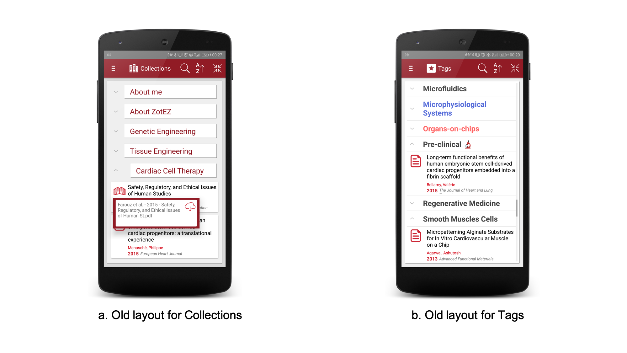 Fig. 1 Previous representations of Collections (Fig.1A) and Tags (Fig. 1B)
Basically, this option is still available in ZotEZ2, but is no longer the default option.
Since ZotEZ2, you can discover a new setting under the Labs tab, as shown below (Fig. 2):
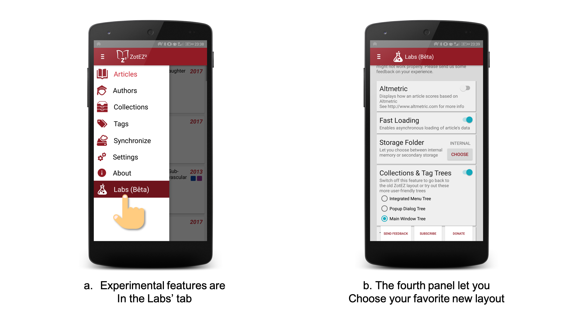 Fig. 2 How to access the newly available layouts
This menu lets you choose between 4 different options:
1. The legacy ZotEZ layout (Fig. 3) is available by switching off this experimental feature.
This layout has the advantage of mixing the Collections/Tags and their own contents. You can search for Collections/Tag, sort them and collapse all/expand all the contents using the top menu. Additionally, you can interact with the documents present within a Collection/Tag in the exact same way as you would in the Articles' tab.
However, there are many drawbacks, that explain the new layouts: the hierarchical tree was always open (you cannot collapse a collection if it has subcollections), and the tags were not allowing any combination.
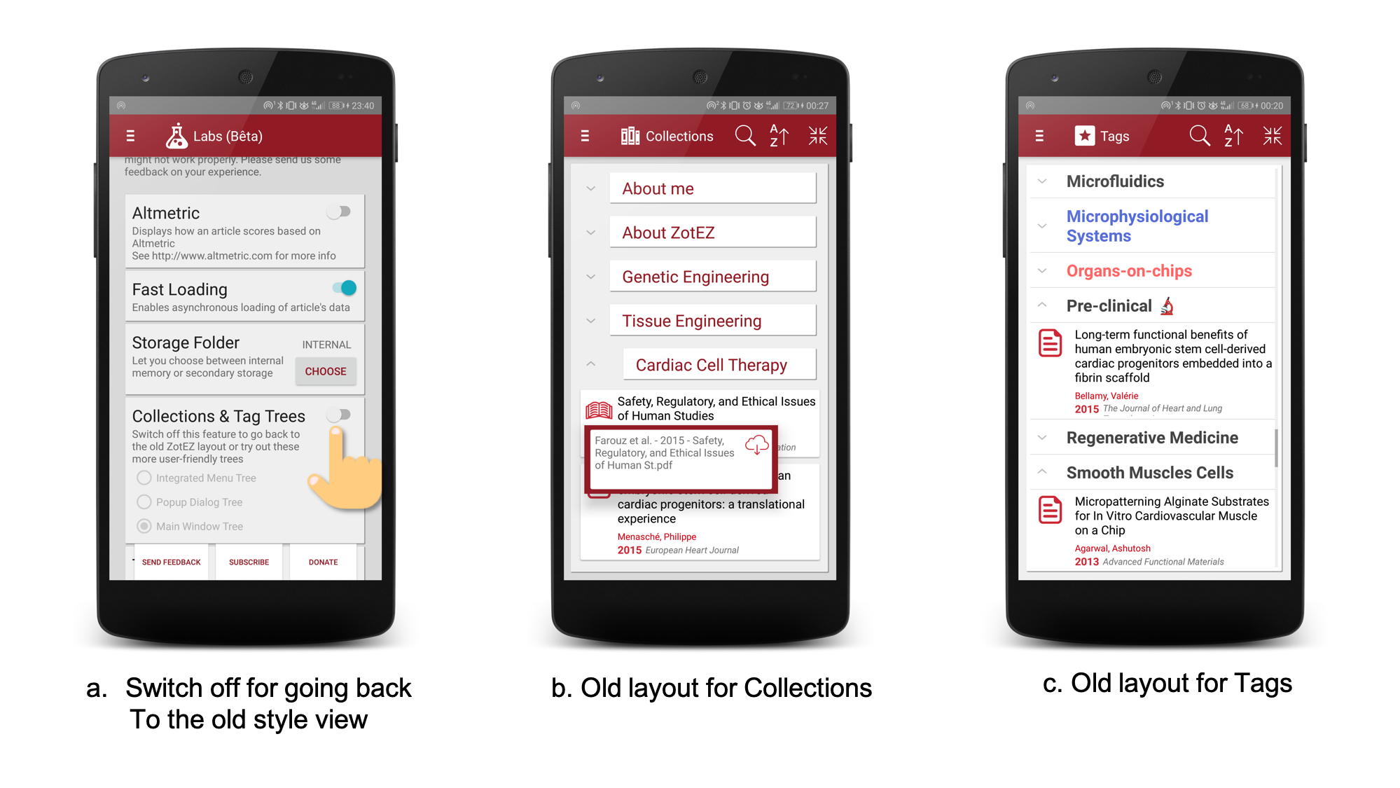
Fig. 3 Screenshots on how to switch back to the old layouts
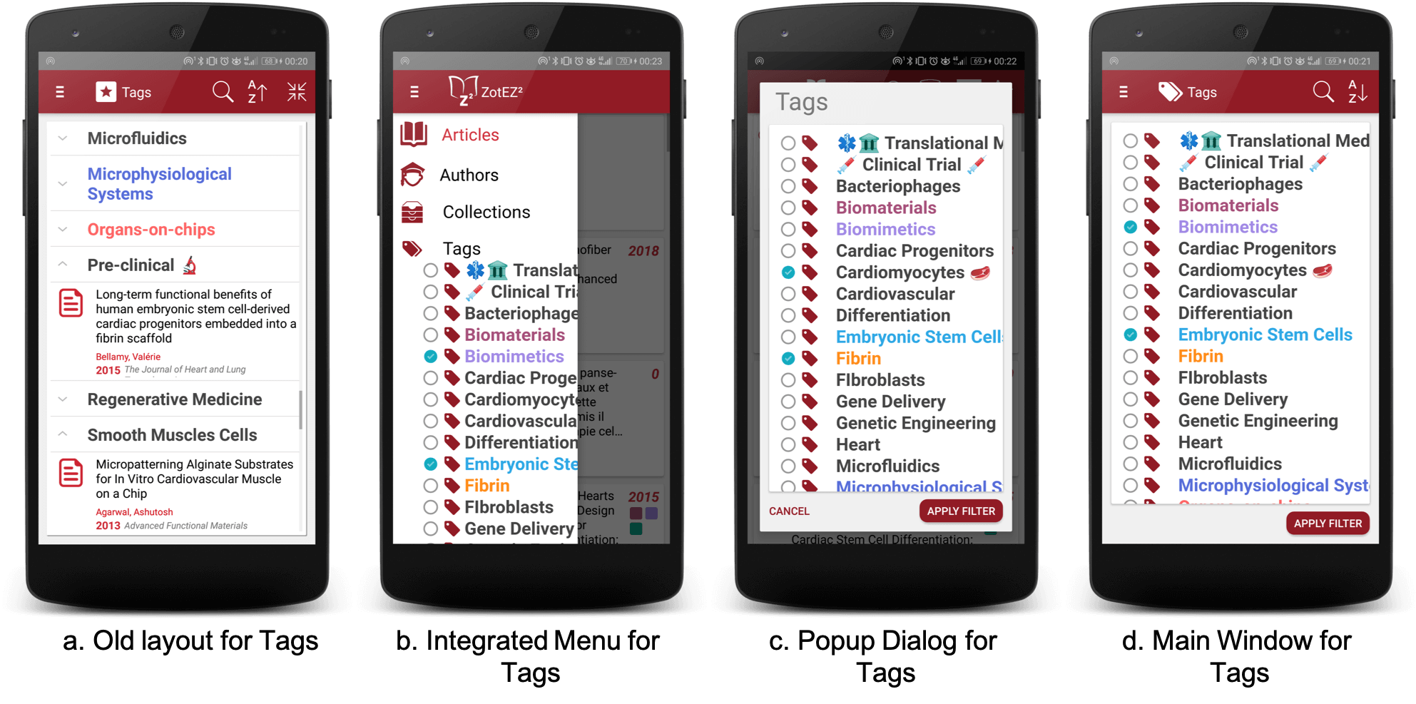
2. The option to display everything in the navigation menu (Fig. 4)
This layout is quite elegant and compact. Whenever you double click on the collection, it basically opens a search in the Article's tab for this very specific collection. As for the tags, you can search them using the checkboxes and then doing a double-click to validate your choises. In the end, this is the layout that matches best the way people interact with Collection/Tags on their Zotero Desktop app.
The drawbacks can be that you cannot perform a search for tags or collections yet, and that some people might find it not that easy to trigger the search (double-click) instead of just browsing the Collection tree (simple click on a node of the tree). Similarly, Tags are selected by simple click, and when the user is done selecting tags, the search needs to be triggered using the double-click, which may be a complex choice for a few users.
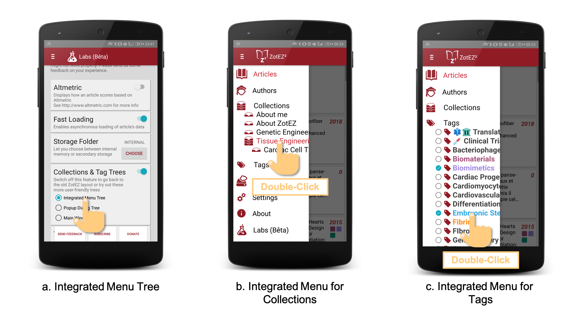
Fig. 4 Screenshots on how to integrate Collection trees and Tag trees within the menu
3. The option to display everything in a popup that will further trigger for objects as mentioned in 2 (Fig. 5)
This is basically the same as with Left Menu (bullet point 2), except that it is displayed in the center of the screen, hence allowing for larger display of complex hierarchies. Note that in both cases, you are always able to swipe left/right in order to see full length names for Collections or Tag
Like in option 2, you can use double-click and simple-clicks in order to trigger the search or simply select some items. Yet, unlike option 2, you now have the option to perform all the browsing/selection with a single click, and then hitting "Apply Filter" will trigger the search.
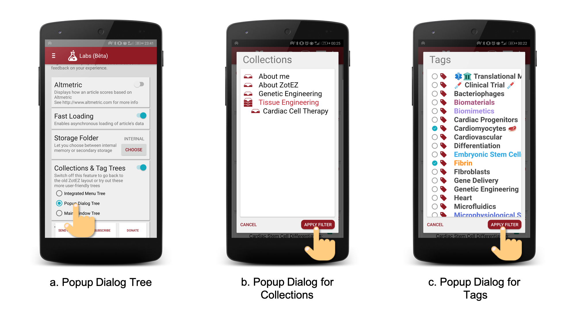
Fig. 5 Screenshots on how to display Collection tree and Tag tree as a popup over any other kind of tab.
4. The option to display everything as a dedicated panel, like in ZotEZ1, but with a more interactive tree for Collections, and the multi-selection option for Tags (Fig. 6).
This is the default option. You'll benefit from the search capabilities of a dedicated panel and from user-friendliness of the new tree implementation. When you select a collection or tag or a combination of tags and then hit "Apply Filter", you'll be redirected to the Articles' tab where all your articles will be filtered according to your search criteria.
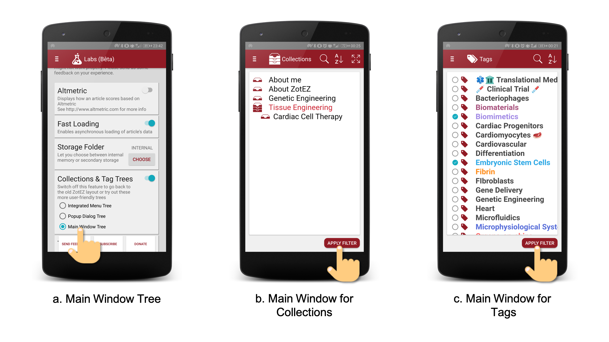
Fig. 6 Screenshot of the default option: a tree representation within a regular window
Currently, the main drawbacks of options 2, 3, 4, compared to option 1 (ZotEZ1 style) are that:
• they are not compatible with some old versions of Android.
• they do not allow the visualisation of the content of a collection or tag directly within the tree.
Other than that, these last three options answer many requests made by many users overtime on the way these trees should work.
However, they are still in development and you can make your voice heard by answering this very short form.
And you, which one do you prefer?